Made to keep busy people organized; even on the go.

UX/UI Design, Branding, Front-End
Most note taking applications are complicated. There are more options than necessary to record inspiration. The result is a cluttered experience that makes finding content confusing and inconvenient. Scribble works to give its users a simple, clean and effective way to save, retrieve, and share information online.
Through extensive user research, competitive analysis and user testing, we created Scribble to keep our ideas close. Our process revealed that our users wanted a quick way to create, save and share content (images, notes, checklists, and links) on their mobile devices and computers.
Scribble was developed based off of synthesized results from user research, competitive analysis, user personas, user stories/flows, wireframes, mockups, branding, prototypes and user testing – all with various iterations.
News and social media make up most content online (84%).
Browser access will be key for the success of Scribble. Most respondents use their browsers to save content (82%) but reported browser bookmarks can become cluttered and impossible to find.
Respondents stressed that they would like an app that could sync across platforms for optimum organization.
Respondents want a product that allows freedom like pencil and paper; allowing users to check off notes – not delete – once they’re finished is necessary.
With an analysis of market competitors Evernote, Google Keep and box, we found that Scribble’s experience should embody the clean, simple interface of Keep combined with some of the user friendly features of Evernote. This analysis helps us make sure Scribble performs all desired tasks of other competitors while but at a more efficient level. Unnecessary attributes will definitely be left out to ensure the most intuitive experience.
Three users with distinct roles were interviewed about their motivations, goals and frustrations. Presenter DJ needs structured organization to make retrieving information easy. Architect and mother Lauren needs easy sharing and syncing across all platforms so she and her coworkers can stay up to date on the go. Teacher and planner Kirsten would like a checklist function that tracks her progress.

Paths for creating content, onboarding and signing in were detailed for new and returning users. This information architecture served as a template for the creation of the site.
Before jumping into the design and layout of the app, we established the overall look and feel of the brand. That included choosing fonts for headlines and body type – Roboto and Shadows Into Light Two. Roboto was chosen for its versatility as it has a mechanical skeleton but features friendly and open curves. Shadows Into Light Two was used to bring more life to the design; adding a playful, personal feel. We chose cool gray tones and blues based off of color psychology. Blue exudes prestige and trust while the added orange provides playfulness and excitement.
#2dc4bb
#757575
#e2e2e2
#141414
#1294ca
#ffc200
prefered in preference testing
Low-fidelity wireframes were created, tested and experienced many different iterations before graduating to the the high-fidelity stage. The first round of testing took place on Peek, where random users were asked to complete a specific set of tasks. A usability test script was then developed and three users completed video usability tests on a clickable prototype. These responses were then thoroughly examined. Changes were made so users could navigate the site more smoothly.
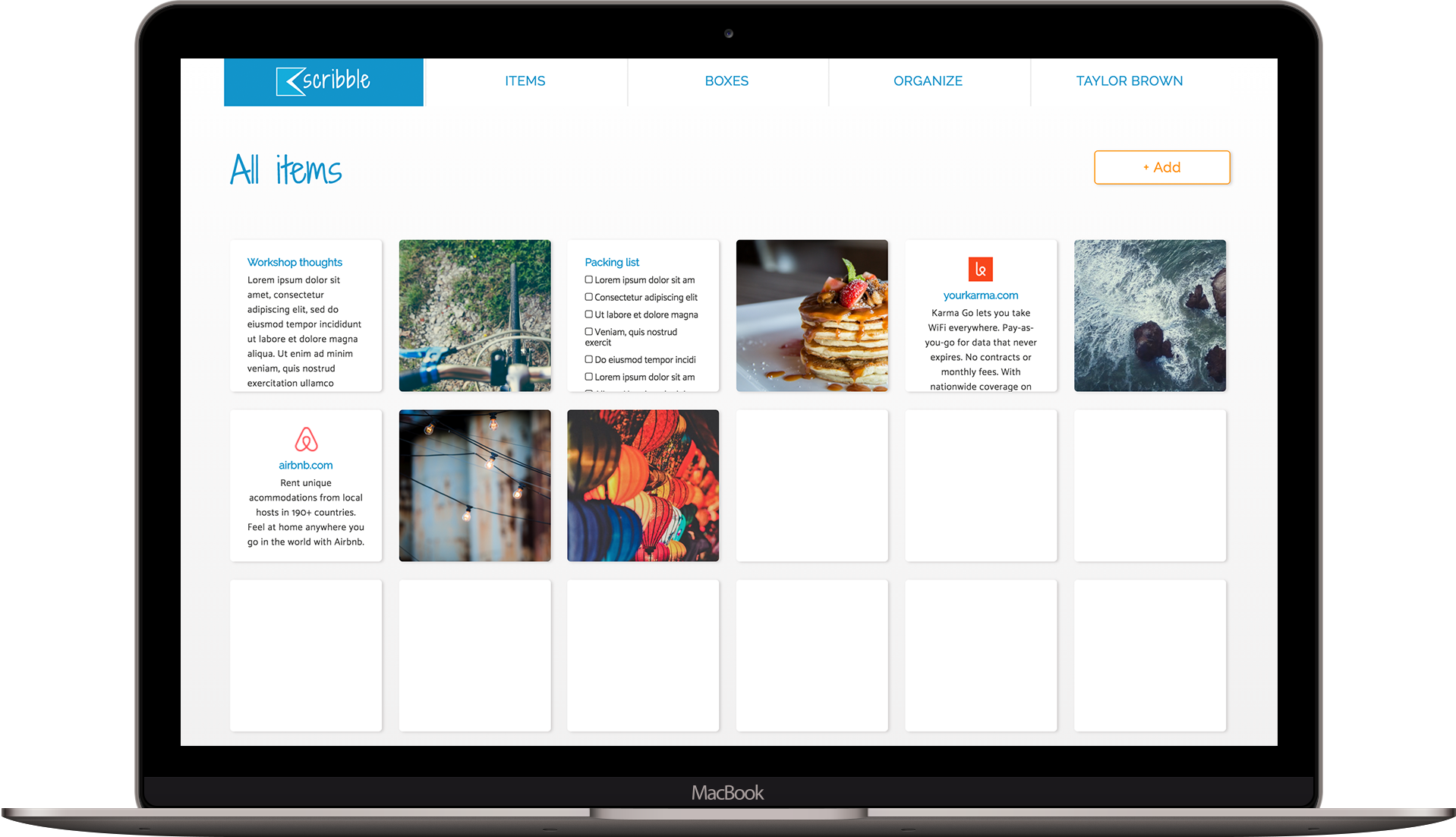
Once we were satisfied with the architecture of the site, we began to build Scribble. The first step was applying color and images to the layout. Informative, function based images were used for the background. Next, we built a clickable prototype on inVision that we used for multiple user testing experiments including UserTesting videos, five-second tests, nav tests and preference tests. A big discovery through testing was that users weren’t finding the “add” button as quickly as we wanted. So, we enlarged the button and made a seperate space for it under the main line of navigation. The results from the final nav test showed a 100% success rate.
Once we hit a 100% user success rate. Scribble was built.
After thorough testing and many design iterations, Scribble finally embodies a user friendly structure, which gives users a quick and easy note-taking experience.
User testing feedback was a crucial part that helped inform the user experience and design of Scribble such as the change in navigational structure and the color of the add button.
More importantly, we were validated by positive user responses. Users described the design as “trustworthy,” “modern,” “clean” and “easy” during the testing process, which confirmed Scribble provides a positive user experience.